Solution Navigator supports the Global Products initiative to service 11 Product Business Units across all global regions contributing to $12B+ in Annual sales for Johnson Controls.
Since FY16 Solution Navigator has been building capability for North American customers resulting in 85,000 Users and influencing $12B+in sales with expansions into global markets. Ending FY21, the Navigator Portal supports over $7.1B of Global Products revenue.
This project drives to evolve the platform “capabilities” into a UX that is fast, flexible, visually appealing, and doesn’t drop capabilities from previous investments in order to support multiple personas ranging from large scale distribution partners to frontline dealers and technicians. The platform needs the ability to manage large projects, see inventory, and view shipping dashboards. Additionally front line sellers, dealers, contractors, and installers need a mobile-optimized experience for parts lookup, warranty registrations, and product comparison.
From 2019 to 2021 I led a UX team in the full re-design and globalization for this effort. I am currently the Sr. Manager of UX/CX Strategy for the platform.
UX Product Manager
Digital Strategy
Persona Mapping
Site Architecture
Responsive Design (Sketch)
Agile Methodology
Design System
Development Handoff
Component Library
Project Management
Direct Reports
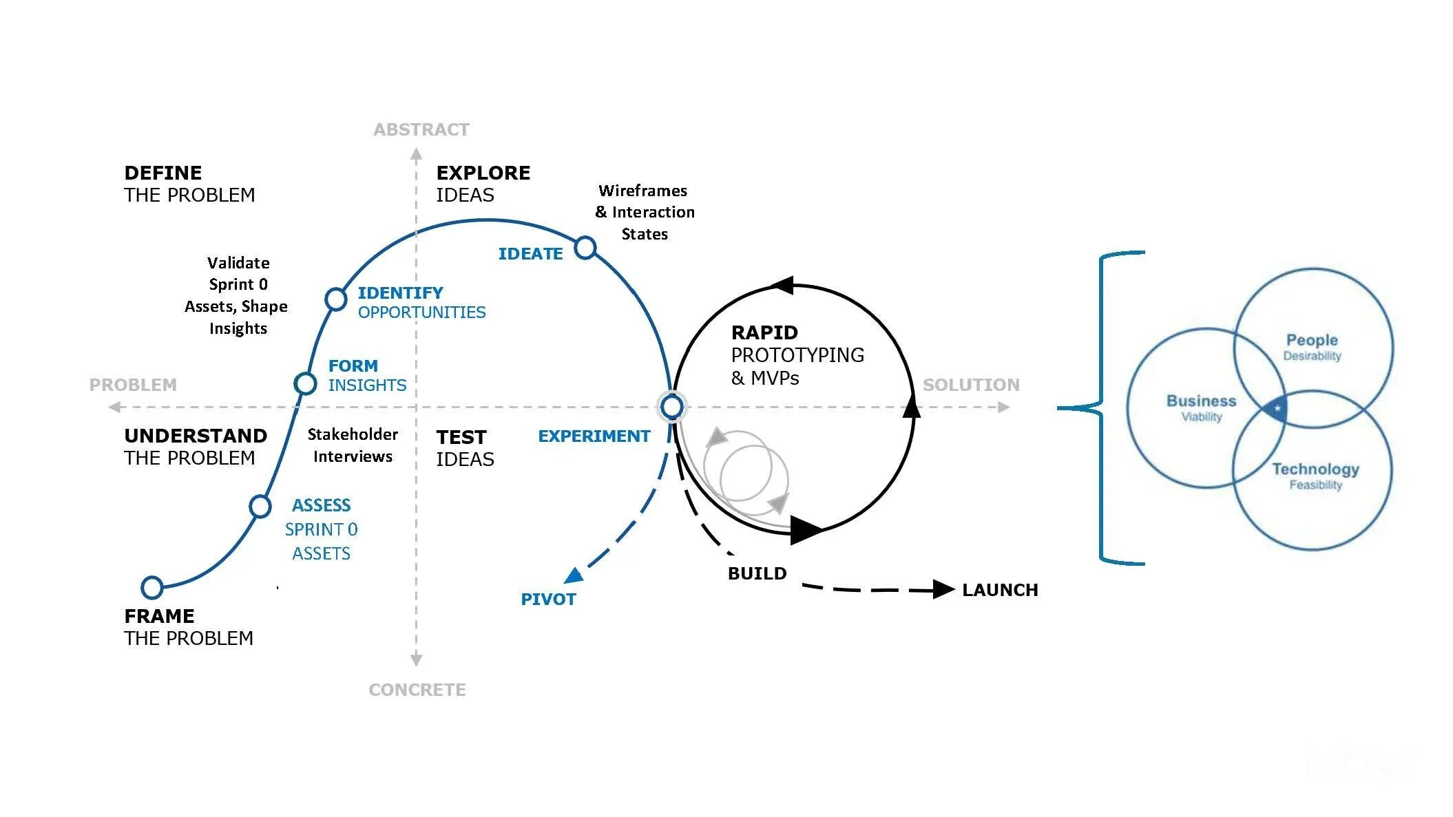
Understanding the Problem
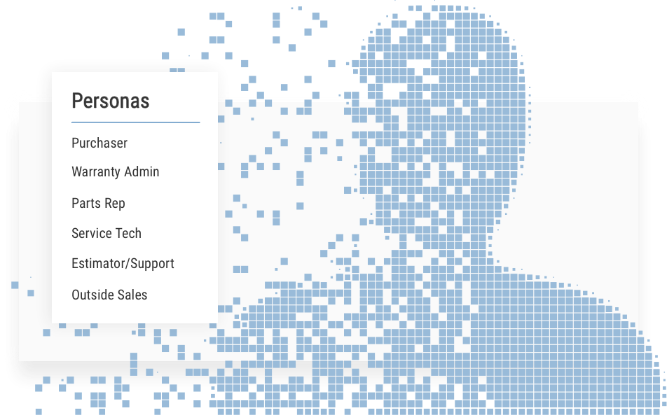
As a platform that previously only served North America, we had access to only that regions user data. However in order to scale globally we would need to talk with JCI business leaders around the world. We started with validating our existing personas and divided them into 6 categories, these groups (each with their own unique characteristics) shared many overlapping needs. We then scheduled multiple rounds of stakeholder interviews from some of our largest regions including the UK, Italy, UAE, Singapore, APAC, China and Switzerland. Each conversation was carefully recorded and we began the process of mapping their pain points.
Insights
We found that each region had produced its own unique tools to help with individual market growth, consolidating these would be a must. With so many disjointed experiences, innovation was slow or impossible. Many of these platforms were based on layers of legacy software and had no responsive value. Information architecture across platforms was dated, and in some areas, too cumbersome to navigate. As a result this produced massive load times and often cost companies work. On top of all of this there was a huge cultural divide in how business was conducted.
Define the Problem
Existing user flows for each persona revealed that it was taking too long to add items to a cart. At around 75 seconds per item it was clear the navigation of the site had become a major issue. Each persona was also getting served the similar experiences regardless if the information on screen was relevant to their need. There was no global search functionality that could effectively help a user navigate and available resources lacked descriptive, consistent, well- formatted content.
Identify Opportunity
Once we understood our users and their pain points we could begin designing solutions.
• Responsive Design
• Comprehensive Mega Menu
• Customizable Homepage
• Quick Checkout Experience
• Reorder History
• Global Search
• Faceted Filtering
• Tiered Accounts
• Request Quotes
• Advanced Order Tracking
• Multiple Address Shipping
• Resource Library
Explore Ideas
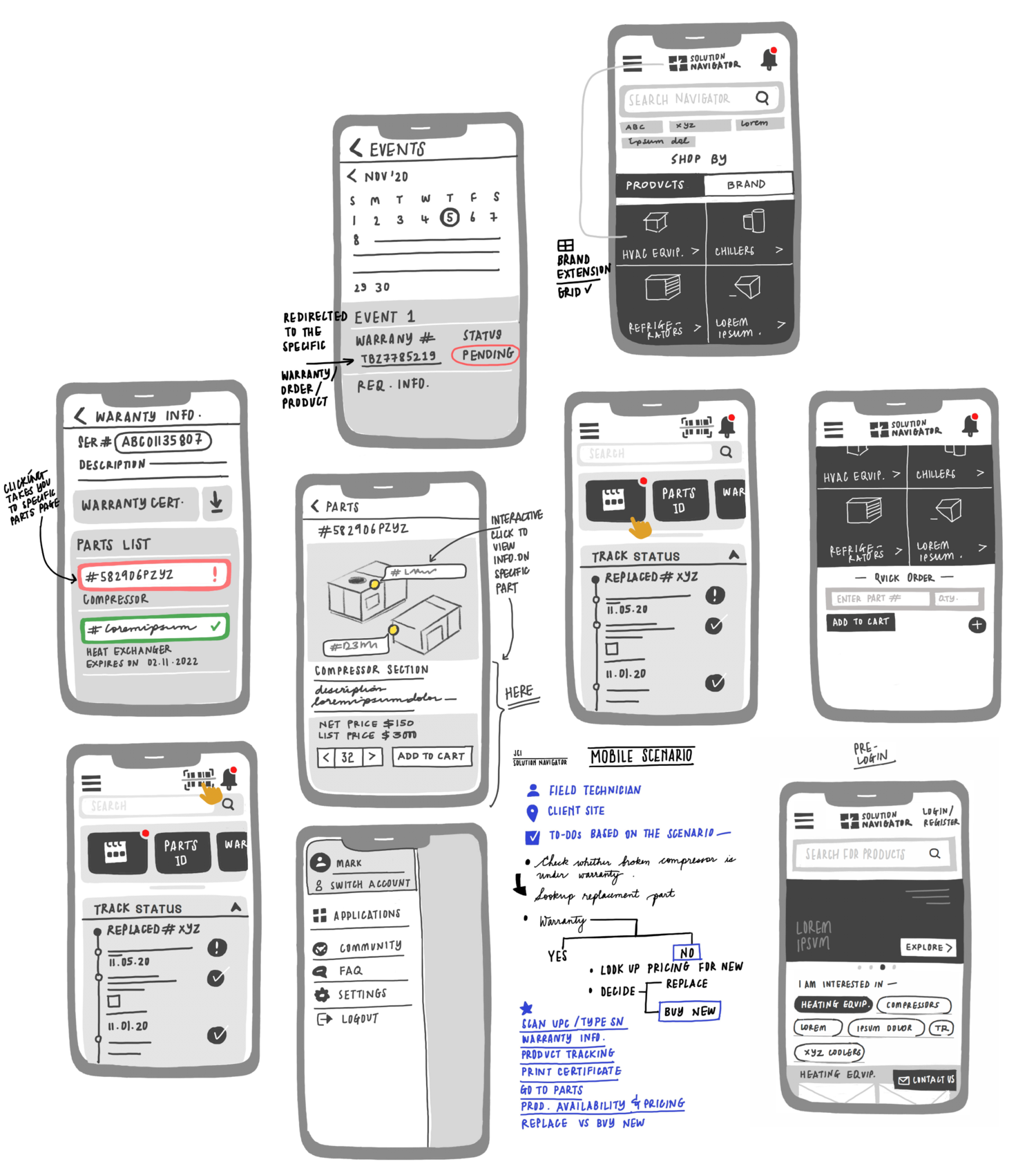
With a mobile first approach, a small novella in stakeholder feedback and a decades worth of legacy tools behind us we began the process of producing low-fi wireframes.
Since at its core this was an e-commerce platform, we focused on features related to this first - these ideas would become the building blocks for all extended functionality we wished to have. Through a multitude of rapid iterations we started to see certain themes rise to the top.
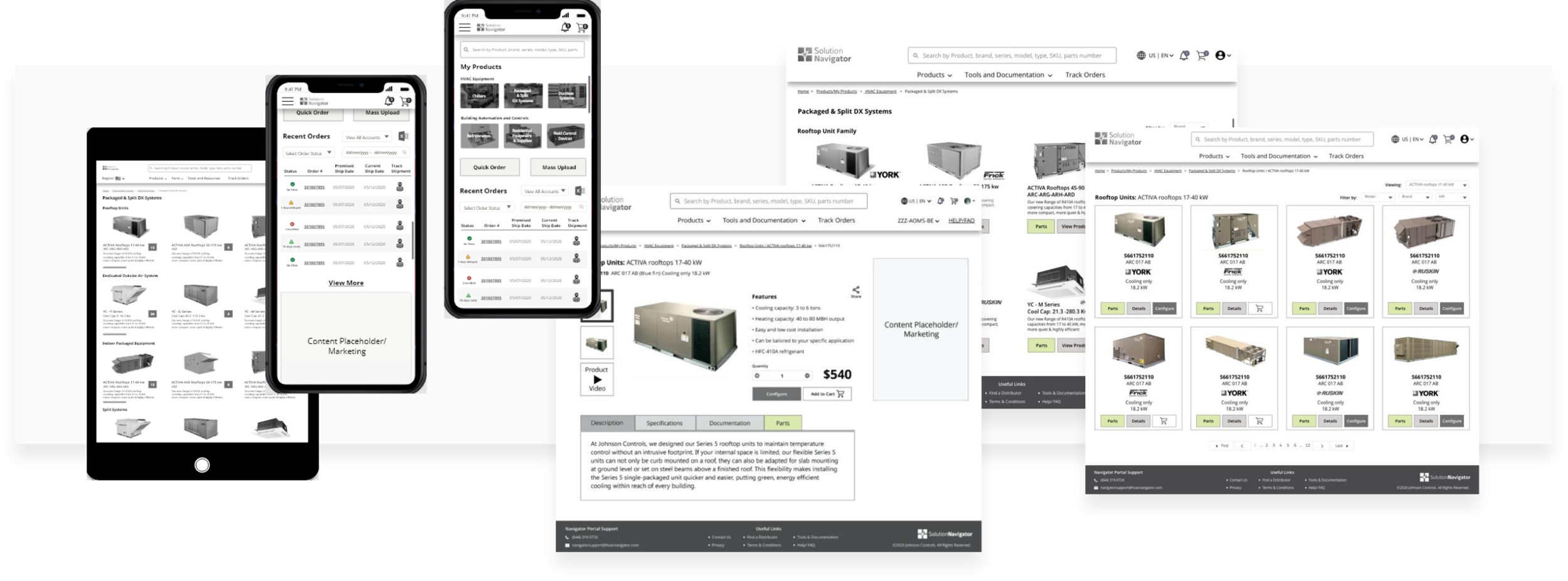
Product page designs uncovered advanced requirements around parts lookup and warranties. We also found that some types of frequent buyers would need the ability to re-order saved carts regularly. Additionally, the ability to sort pages by brand priority and category would pave the way for features like price comparison. The team worked hard in this stage knowing that there was much we could do. Before long we had a solid concept in hand and began taking our first step towards mid fidelity.
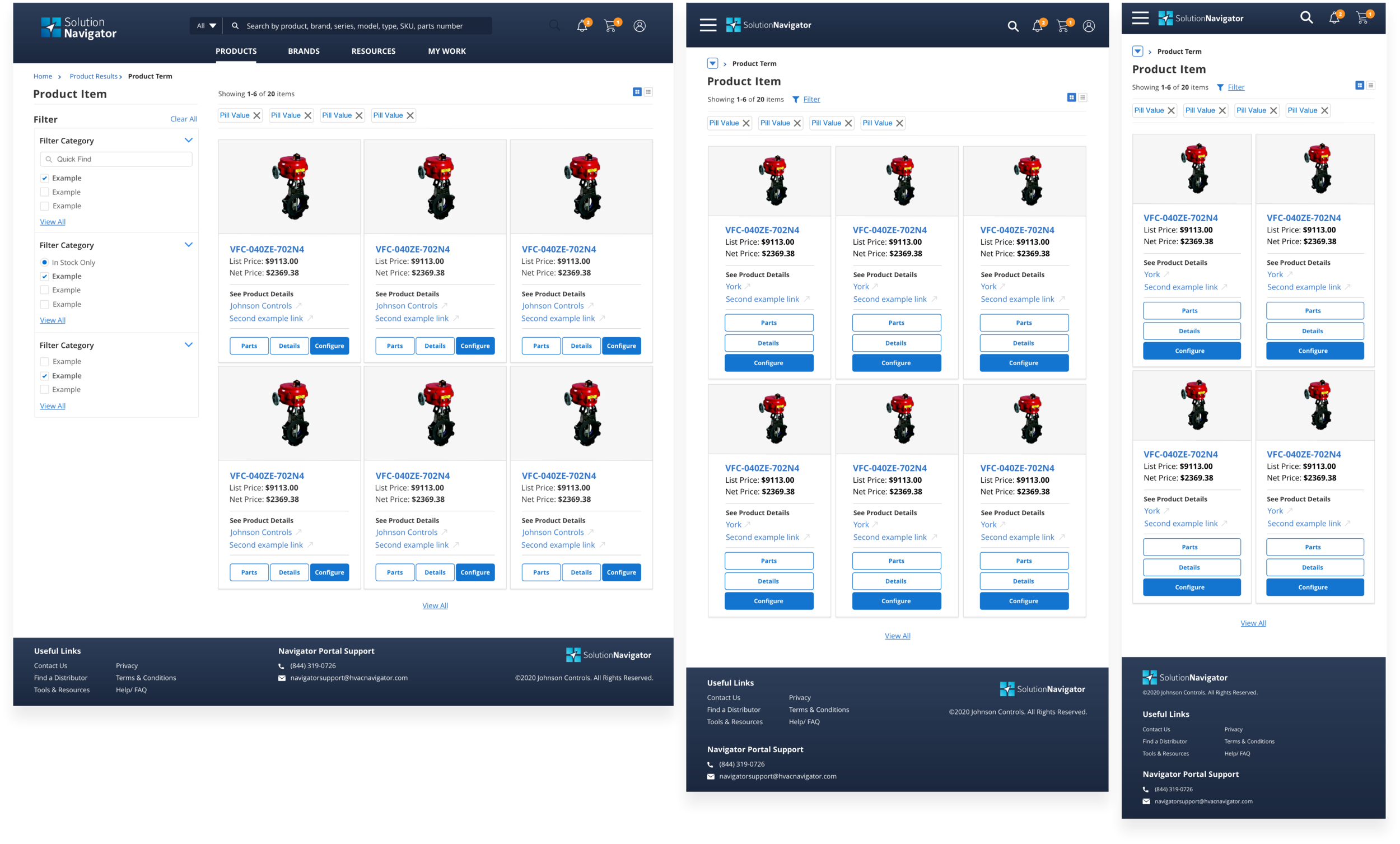
Wireframes (Mid-Fidelity)
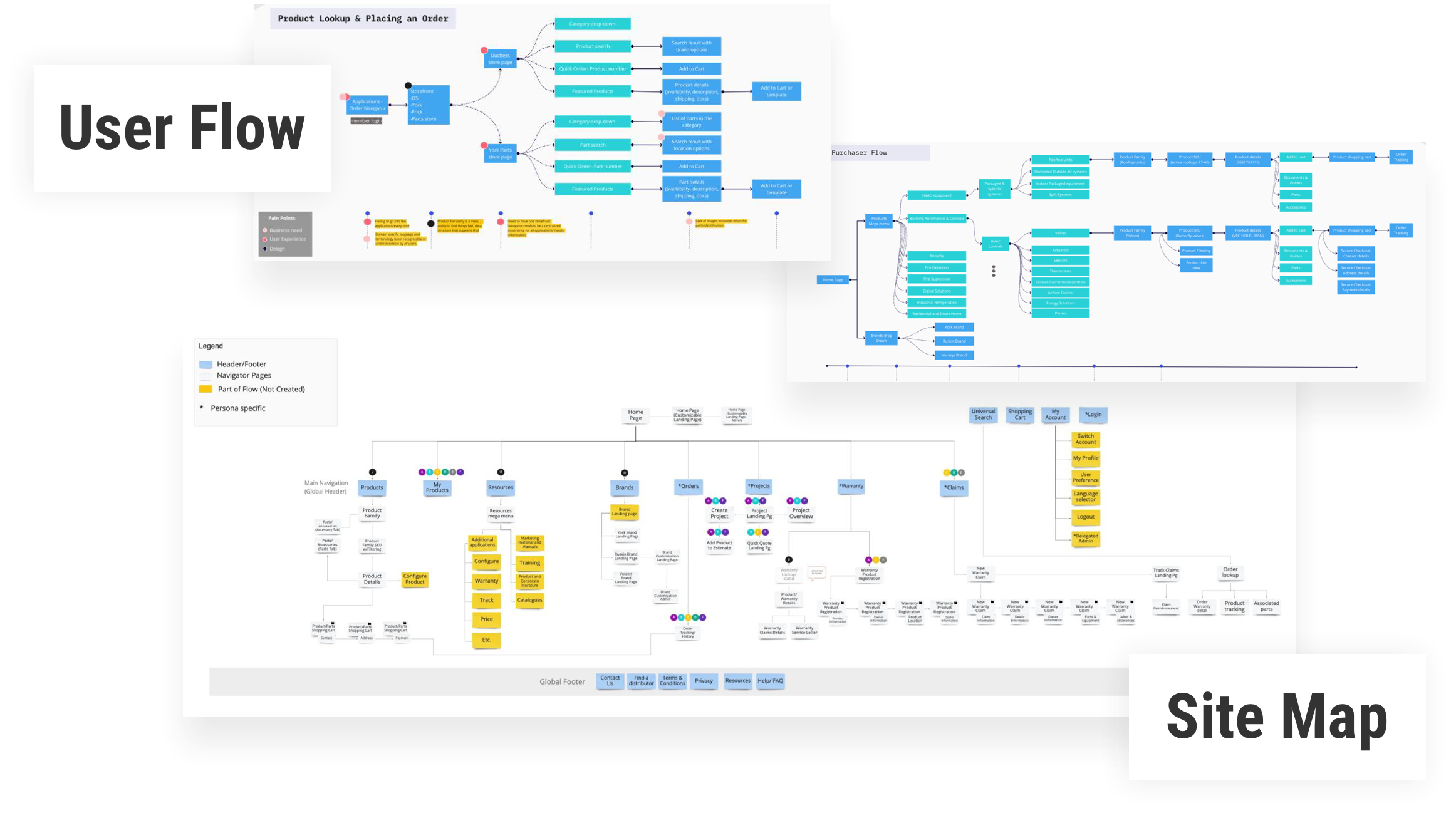
In this stage we focused on visualizing 3 key areas: Information Architecture, Design, and Technical Feasibility. With our ideation out of the way we could begin matching it up with the site map to test the efficiency of our flow. Minor adjustments were made to the architecture to ensure a unified experience centered on our main navigation. We swapped out placeholder information for real scenarios to get a clear understanding of what the layouts would look like in our design. Content areas were then polished until screens had clear direction and each area led the user into their expected destinations. With these two steps completed we mapped the technical feasibility against our design system and development environment to streamline any unnecessarily custom areas.
Experiment
With the content of our screens in a good place I began giving creative direction in anticipation for the final approach. We would be using Salesforce Lightning components so it was critical that we merged brand standards with the SFL design system. We held several rounds of stakeholder feedback and narrowed multiple visual directions down to a single core concept. With the help of our branding team in Sweden, our development teams in India, and the extended UX team in the states we were nearing the reality of a global platform.
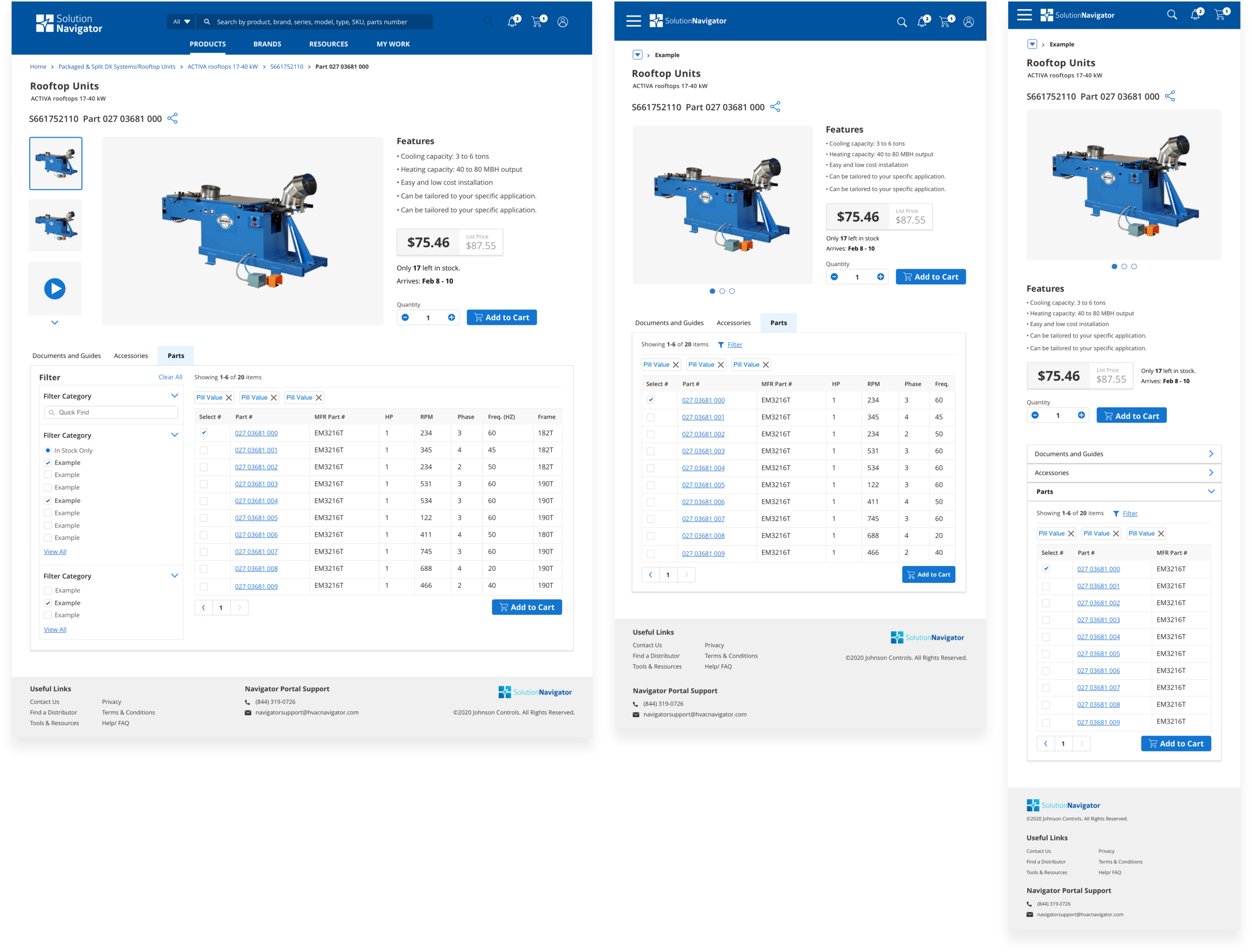
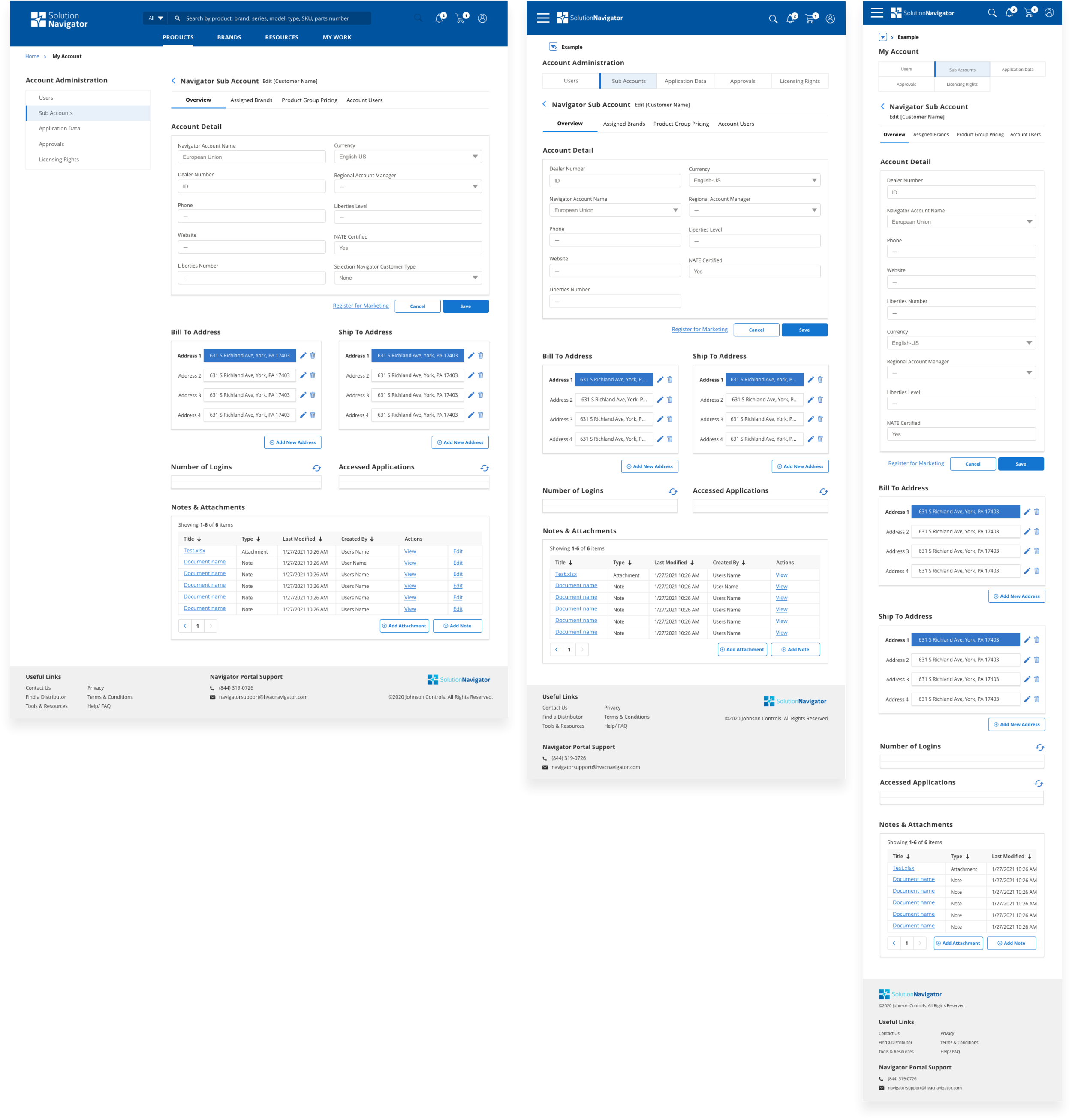
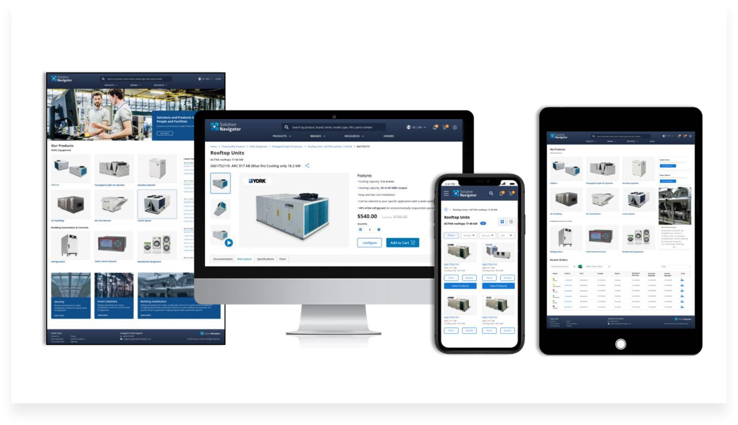
WireFrames (Hi-Fidelity)
After reaching a final approval from all business units, the team switched over to development operations where the remaining bulk of the screens would be designed and built. As the UX Creative lead I took over all design and managed the handoff to development. I attended daily development demos and directed any UX related issues while simultaneously editing our ever growing library of pages. Below are some of the final designs referenced in the mid-Fidelity portion of this case study.